Today graphic design is one of the fundamental aspects in the image of a brand, so it is important that designers are always at the forefront to give a fresh and contemporary air to the brand. Especially in everything related to social networks and websites, so if you want to find out what are the 8 design trends of 2022.
If you are not a designer anyway, this post will also interest you because you can evaluate which are the design trends that best suit your brand so you can consider renewing its image in this new year.
1.- Inclusive design
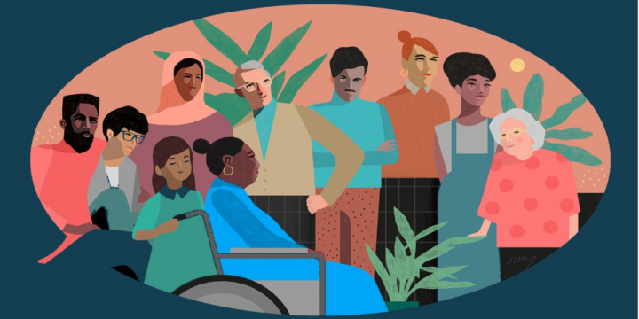
In recent years, movements for equality have gained ground in all aspects of reality. This means that movements like #blacklivesmater, feminism or LGTB inclusion movements have created more and more awareness throughout the population, that’s why nowadays people are more empathetic with these movements and do not hesitate to support brands that are also empathetic with them or that are interested in those inclusion movements, that’s why showing that you are an inclusive brand through your image is a priority in the design of this 2022.
Making an inclusive website or brand image seems like a very complicated thing to do, or some may even think it’s counterproductive for fear of the brand being associated with radical stances. For many people talking about inclusive design is synonymous with using inclusive language and we know that there is still a lot of reluctance to use this language.
However, there are many ways to show that your brand is inclusive without hurting susceptibilities, for example you can use colors related to a movement such as purple for feminism, or you can make a review of the images of people you use on your website and social networks to assess whether you are only representing a social group. If you want to learn more strategies to achieve an inclusive image you can read this guide which is very complete.
2.- Priority in the presentation of data
On other occasions we have talked about how important it is to keep the customer at the center of our company and design is no exception. One of the ways in which we can please our public is by presenting data in a clear and fun way.
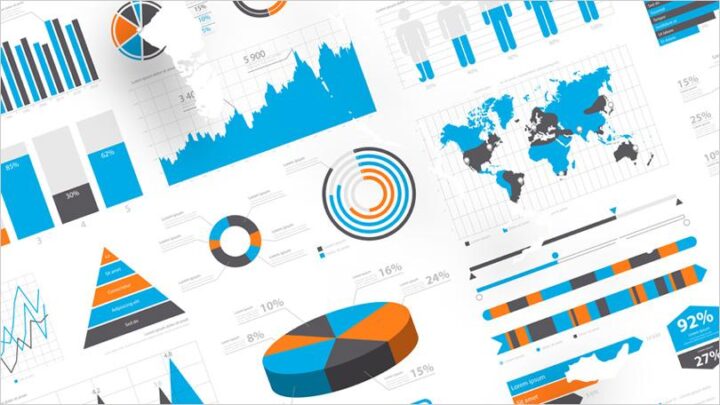
After the pandemic people got used to read data and interpret graphs, so if for the design of your website you need to put some data you can do it without any problem, but it is best that you incorporate them in a clear and entertaining way, even if you can make a short video to present hard data to your followers, they will thank you very much.
3.- Trends that stay
There are some trends that work so well that they are here to stay, of course it is expected that in 2022 they will have a twist to renew them and keep them at the forefront. The first of these trends is minimalism.
Minimalism is a decorating trend that emerged in the 1960s, the trend quickly reached the design and other arts and since then is a style that returns from time to time. In recent years it has come back with a lot of force, even the web pages adopted it quickly.
Minimalism has been a trend in web design for several years and its maxim “less is more” works very well because it is not visually tiring and you can perfectly distinguish each of its elements of a site.
This 2022 minimalism is still a very current trend option for graphic design, however the colors that will be used this year are bright and fun colors like the very peri, which is the color of the year according to Pantone, in addition to shades of green, orange or yellow.
The other trend is vintage or retro style. The passion for the past continues to enchant designers and the general public and this 2022 including retro or vintage elements will continue to be a success, but be careful not to look archaic so use only a few elements, so that it does not look like an outdated or old-fashioned design.
4.- Letter cutting
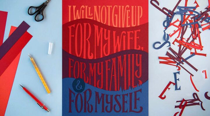
The design trend in 2022 is all about letter cutting. This trend comes from architectural writing, where it was used in monumental masonry and stone carving. It consists of using cut-outs of words of all types of typographies, preferably on a white background, or on a design element, such as images, objects, other words, geometric figures or spaces without elements.
Another of the most used aspects in this trend is the combination of textures, so you can use cutouts of other textures on a simpler and smooth background, this will help you create a more dynamic and striking design, without being oversaturated.
5.- Use of quotes in strategic places
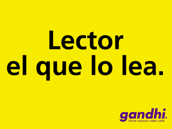
On other occasions we have already referred to how important it is to keep opinions or reviews about our products or our brand in a visible place, especially if they are positive. Designers are well aware of the power of opinions, that is why they have become an important part of the design of a website, blogs but especially in landing pages.
The way you can include these opinions within the design of the page is through the quotes highlighted with different and larger typography, which may or may not be accompanied by an image.
So if you have an opinion from a customer or a reviewer that is positive and that you think has the power to draw the attention of future customers do not hesitate to put it in a prominent place within the page.
WordPress has the option to insert a quote and immediately places it in a more striking way than the rest of the text without having to change the font size, type or color, so if your site is built on this platform you can use this tool to incorporate the quotes you need.
6.- Maximalism
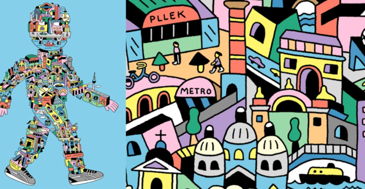
Just as you read it, this 2022 for design is a year of contrasts so not all trends can be classified in a couple of styles, that’s why it is perfectly feasible to see opposing trends between them. This is the case of maximalism which is the exact opposite of minimalism.
This trend looks for a flashy and colorful style, forget about “less is more”, because here “more is better”. If you are interested in creating something like this you can mix several colors at the same time, together with several textures. You can also mix several opposite elements like retro with futuristic elements.
So you know if you are a fan of colors and you like to innovate this style of “organized chaos” is just what you need, especially if you are creating designs for centennials.
7.- Virtual reality
Virtual reality seemed like something that would be many years ahead of us, however thanks to technological advancement and since the announcement of Meta by Mark Zuckerberg as the evolution of the internet into an immersive experience, virtual reality has become more tangible.
The virtual reality craze has reached the world of design. Incorporating augmented reality into your work is very simple, you can add curved backgrounds, 3D images and shapes, and any element that gives a sense of depth. In addition, both Meta and Microsoft are investing money and time in the development of projects to bring it to the world of design.

8.- Typographies
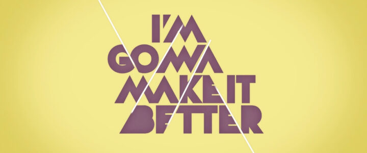
For the last couple of years typographies have taken a leading role in design, so forget about leaving such an important aspect as this to chance. If you want to give an avant-garde air to your designs, the best thing to do is to use kinetic typography, which is here to stay.
Typographies are especially important if we talk about logo design, remember that a logo is the first impression of your brand, so if you want to get inspired with the best fonts for logo design you can check this Crehana tutorial that teaches you how to choose the best for your brand.
Of course, you can’t forget to include the color of the year according to Pantone, which is Very Peri, a very warm purple tone that combines the qualities of blue with the joy of purplish red. Now that you know the design trends for 2022, tell us which one is your favorite?
